

The Movie Poster

THE MOVIE POSTER
Few things have contributed as much to the rise of what is known as “star system” in the entertainment industry as the movie poster. An actor’s placement on the poster is one of the first things discussed when negotiating a role in a film, and its importance is so great that the word “poster” has become an adjective associated with a movie star’s fame.
That was perhaps the industry’s intention when it was created in the early years of the 20th century; according to all accounts, it was based on the lithographic work of a French artist named Jules Cheret, who had been creating the eye-catching advertisements for Moulin Rouge, Folies Bergère and the Olympia in Paris. These were handcrafted posters, of great artistic value, printed using lithography and distributed within small, interested circles; yet they brought fame and fortune to their creator, to the point that he is cited as a key figure in the emergence of the modern poster.
While common and essential elements—such as images and typography, which in this case takes on great importance—are certainly important, it is actually the selection of colors, the treatment of the image, and the ability to compose and use space that determine the success of the design. And although in recent times print media has largely been replaced by digital images found on websites, social media, and other “virtual” platforms, movie advertising still relies on two fundamental elements: the poster and the trailer

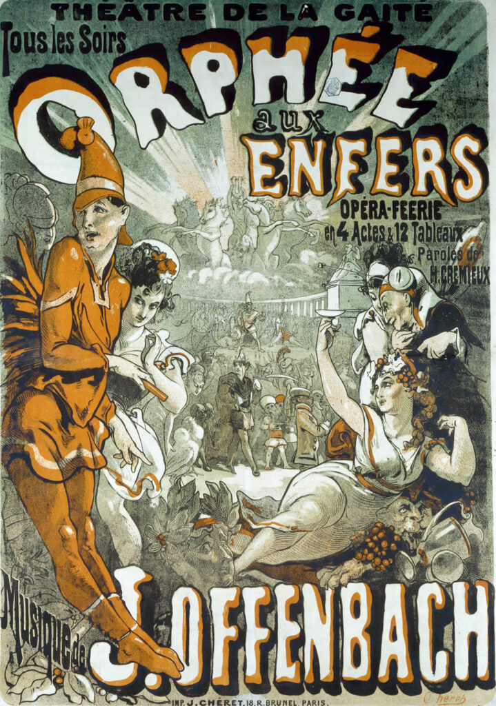

Jules Cheret (May 31, 1836 – September 23, 1932) was a French painter and lithographer who became a master of poster art. Work in the public domain.
The passing of the years
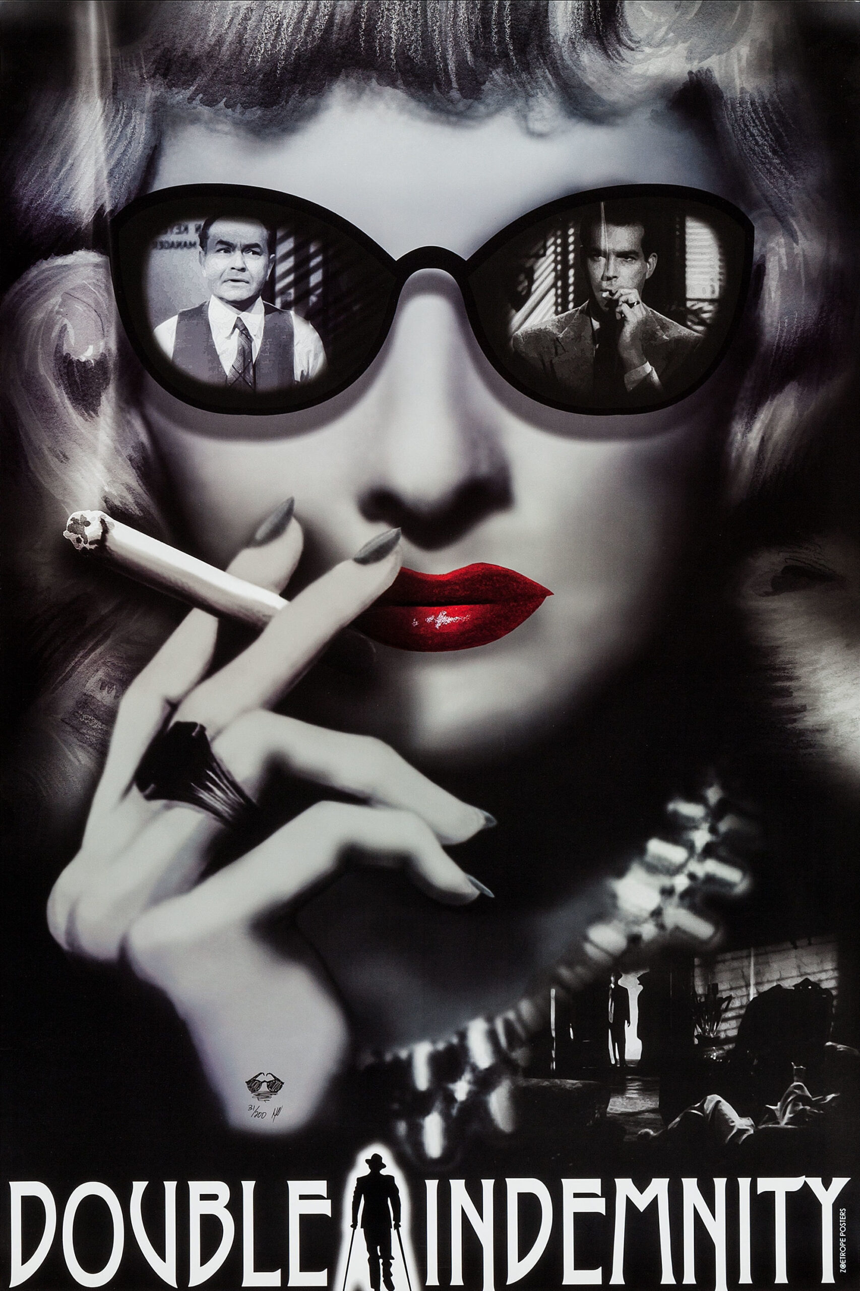
The art of the poster began to be documented in the early years of the 20th century, specifically in the 1920s, a period when posters were artistic pieces, handmade with beautiful illustrations and highly elaborate, ornate typography. A representative example from that era is the poster for the film Metropolis (1927), considered innovative and unprecedented; the transition to the 1930s—which many consider the golden age of cinema—brought Art Deco influences and shifted the focus to the films’ protagonists. Bold colors and whimsical typefaces were used.


The 1940s were uneventful due to the war and widespread censorship, and the 1950s became somewhat more complex with the advent of television; as a result, reinvention became crucial, as the first attempts were made to promote films using TV spots. The most notable change was the almost absolute prominence typography acquired; one of the great posters of the era is that for the film Ben Hur , considered one of the 20 best posters in history.


Copyright © respective movie studios. Intended for personal use only; reproduction as printed posters is strictly prohibited.
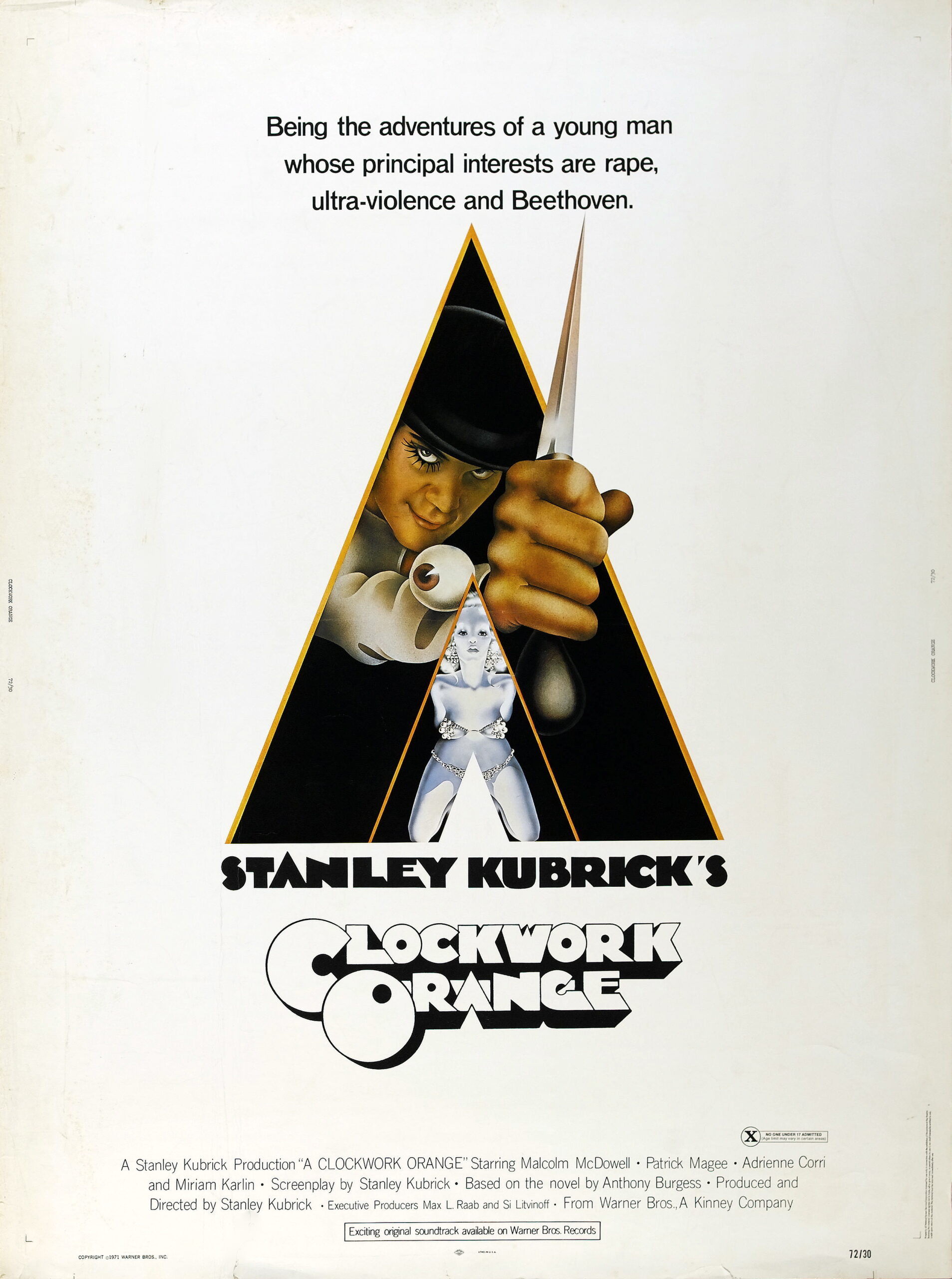
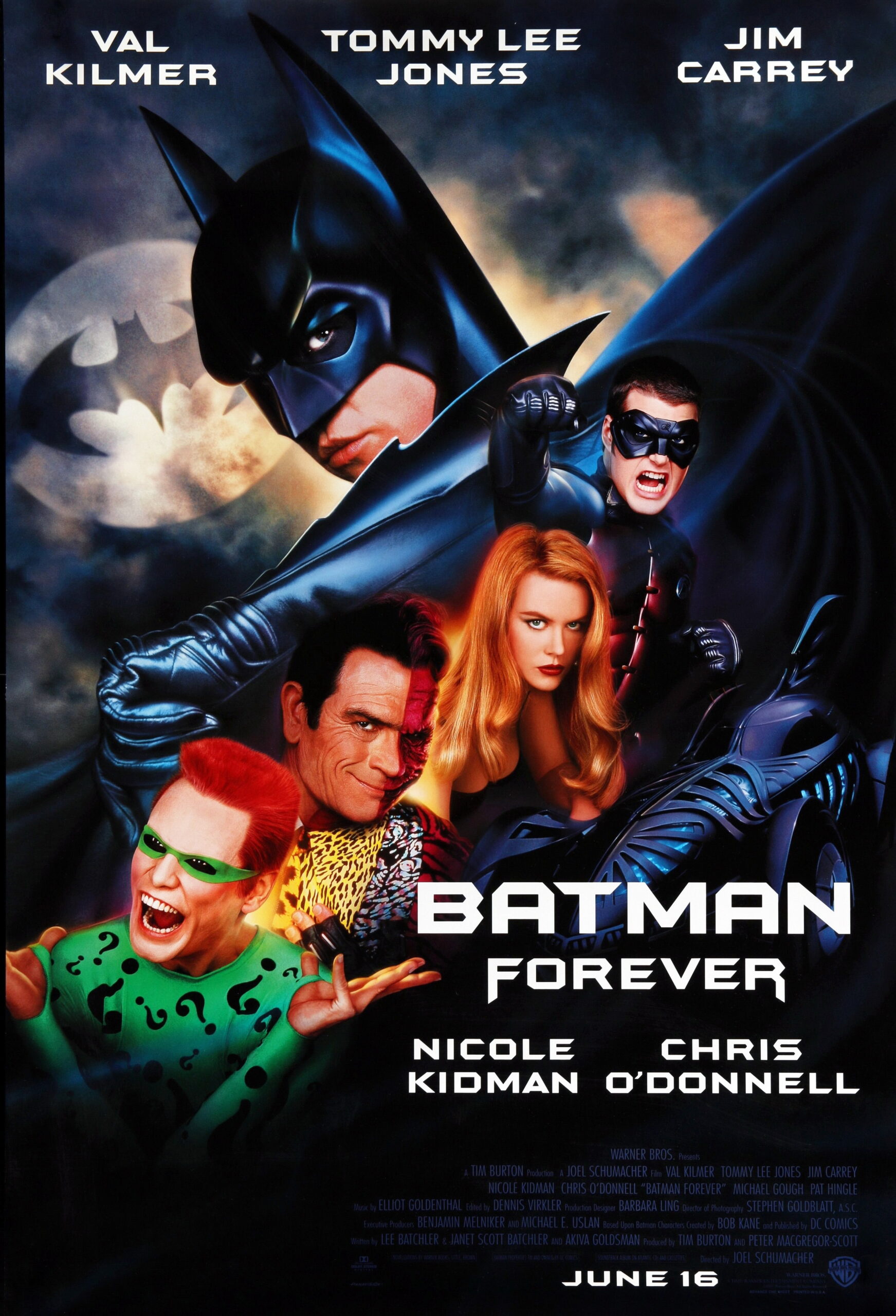
The 1960s gave way to photography; the movie stars, in character, took up most of the poster, giving rise to what is known as the photographic poster; while the 1970s ushered in the prevailing psychedelic theme, producing very eye-catching posters. The 1980s and 1990s already begin to showcase the poster style that would dominate the 21st century: graphic compositions with a strong sense of balance, large artist names, less ornate yet equally eye-catching typefaces, and meticulously designed backgrounds.


Copyright © respective movie studios. Intended for personal use only; reproduction as printed posters is strictly prohibited.
The Big Names in Cartelism
We have already mentioned Cheret, whose indisputable role in the genre’s origins makes him its founder; however, we must also include the names of those who transformed the task of designing a movie poster into a work of art.
Saul Bass
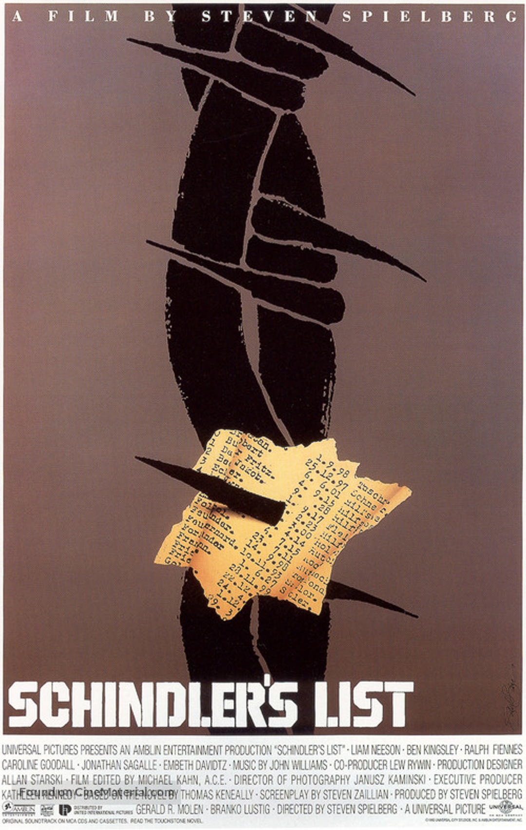
The undisputed king of graphic design, creator of the posters for Hitchcock’s *Vertigo* and Billy Wilder’s *Love in the Afternoon* by Billy Wilder and many others, an artist who extended his influence to the creation of opening credits and titles for films by Martin Scorsese and Otto Preminger.
Saul Bass was a renowned American graphic designer, known for his work in the film industry and for designing some of the most prominent corporate identities in the United States.


Copyright © respective movie studios. Intended for personal use only; reproduction as printed posters is strictly prohibited.
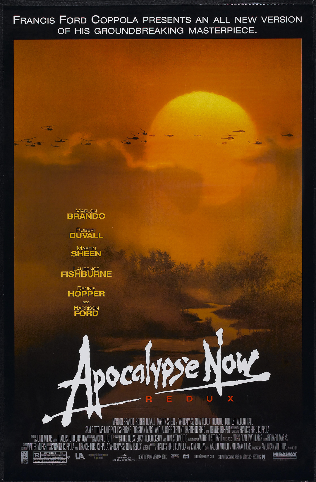
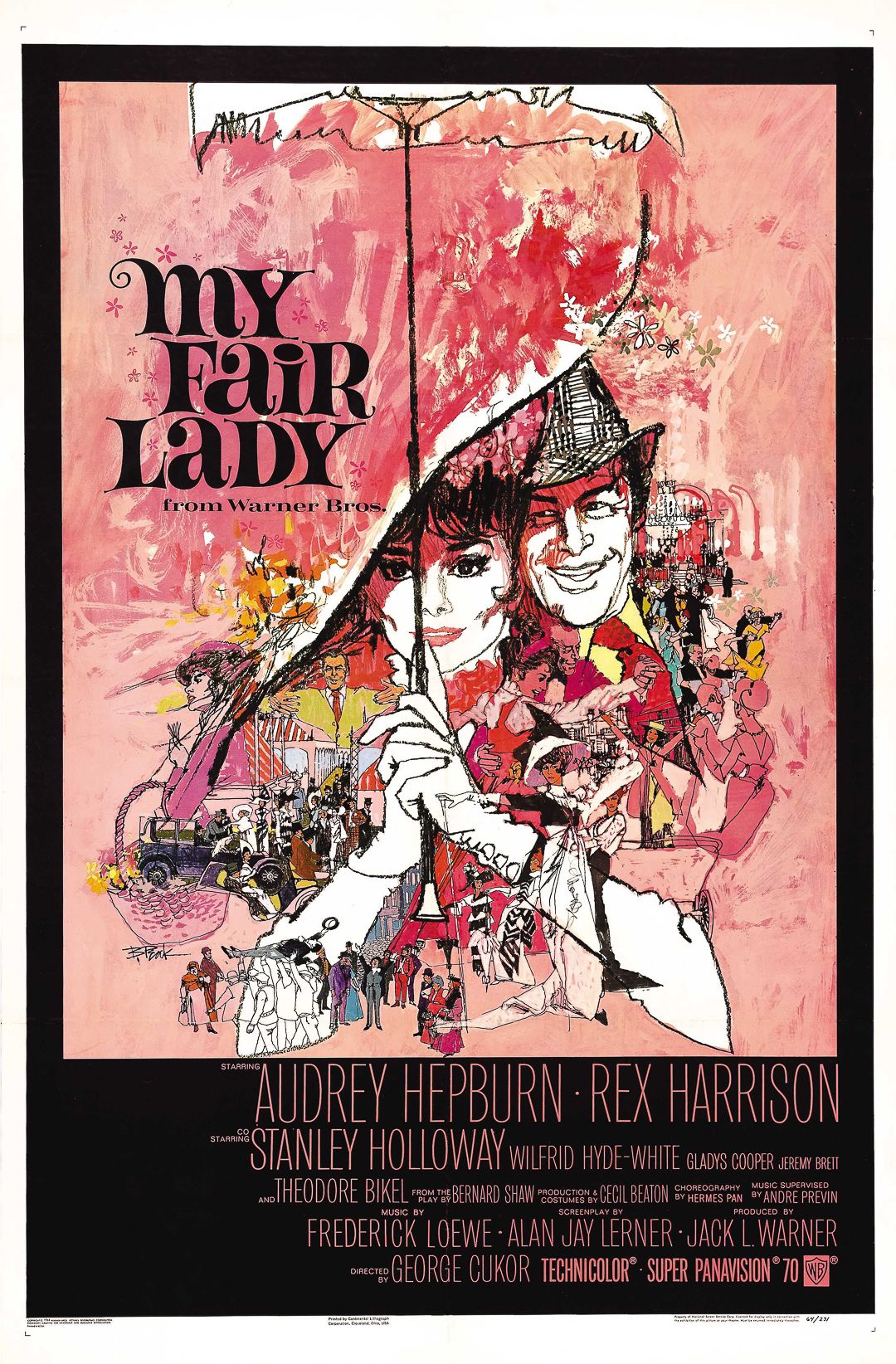
Bob Peak
He was the one who designed, among many others, the posters for Superman, Star Trek and West Side Story, although for the latter, Bass did all the title design.
Bob Peak was an American commercial illustrator. He is best known for his contributions to the design of modern movie posters. His artwork has appeared on the covers of *Time* magazine, *TV Guide*, and *Sports Illustrated*. He also illustrated advertisements and U.S. postage stamps.


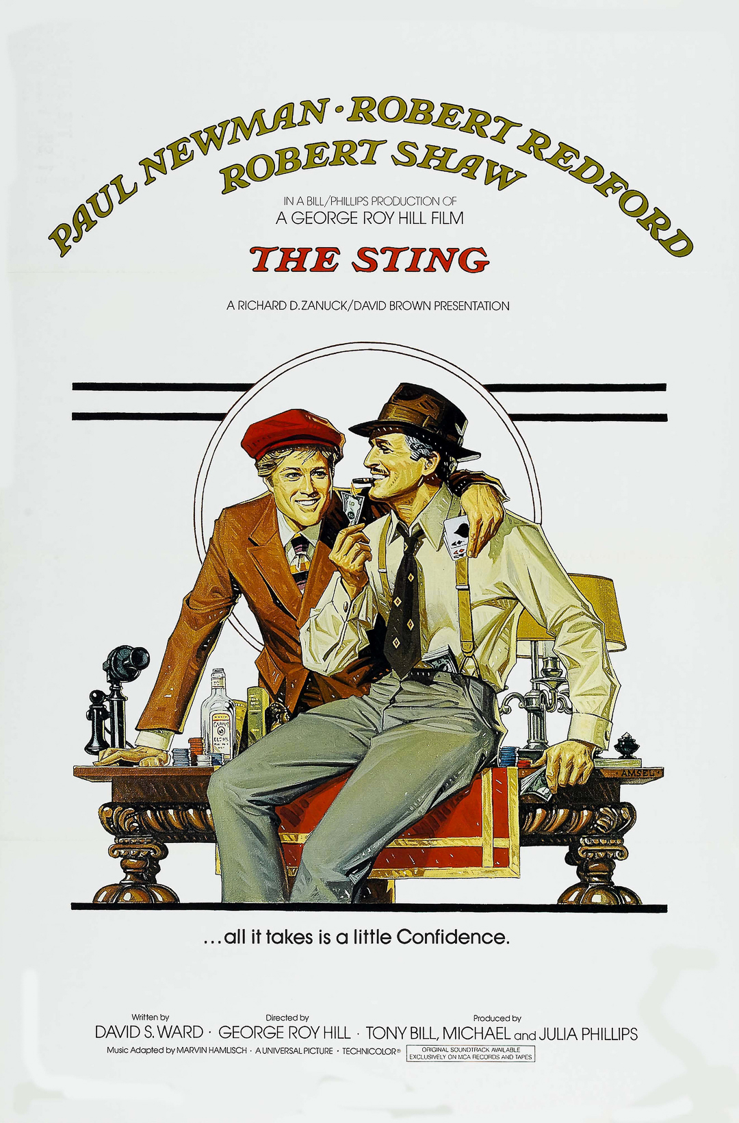
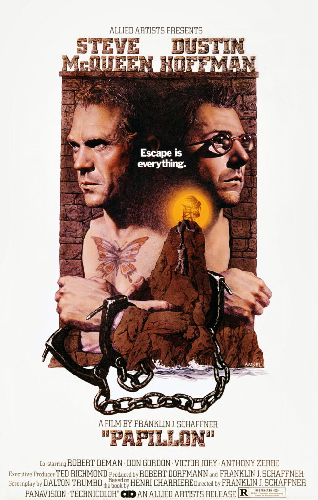
Richard Amsel
Who was commissioned to design the poster for Hello Dolly , the famous musical starring Barbra Streisand, after winning a national contest sponsored by 20th Century Fox.
Richard Amsel was an American illustrator, graphic designer, and poster artist. His career was brief but prolific, encompassing movie posters, album covers, and magazine covers.





Jhon Alvin
Creator of the world-famous poster for Blade Runner, a film that, simply by virtue of its existence, had a poster that is now considered legendary.
Jhon Alvin was a Hollywood poster artist who worked with Steven Spielberg, Mel Brooks, and the Disney studio. Alvin graduated from the Art Center College of Design in Los Angeles and went on to become a freelance artist.




MAC
The only Spaniard in that “A-list” group of designers favored by Hollywood studios: Macario Gómez Quibuz, known as MAC, who was chosen to design the posters for “The Ten Commandments,” “Doctor Zhivago,” and dozens of other films.
A Spanish movie poster artist, known professionally as “Mac,” who lived in Olesa de Montserrat, Barcelona, from the 1970s until his death. His posters are characterized by creativity, nonconformity, and harmony.


The Unwritten Rules
However, design characteristics alone are not the only factors that matter. Over the years, conventions that are based more on custom than on logic have established a set of guidelines that ensure, at the very least, the effectiveness of the resulting poster. They are certainly intriguing, especially since they are, in fact, very effective.
For example, there are four colors that indicate the movie's genre: yellow stands for independent films, red for romantic films, black for horror films, and blue for films involving animals.
The characters’ poses in the photo also tell us something: if they’re floating in front of the sea or seem to be emerging from a somewhat bucolic landscape, it’s a melodrama; if, on the other hand, the setting is more urban and (especially if) they’re standing back-to-back, we’re looking at a romantic comedy, complete with a touch of animosity.
If the main characters are huge and don't show their faces, it's definitely a superhero movie, and if they're seen running at full speed or engaging in slightly "dangerous" stunts, we've got a action action thriller,
Although it might seem a bit like a joke, there’s a whole way of “reading” the main character’s body language on the movie poster; for example, if the film has slightly “racy” content, the female lead will appear in a somewhat sensual pose, whereas if it’s a historical film or one with much “more serious” content, the female lead’s gaze will convey the greatest emotional intensity.
The Poster as a Work of Art
There is no denying that movie posters are among the best reflections of the visual and graphic style of the era in which they are created, and they say a great deal about the prevailing artistic movement in the society that produces them. They have a single purpose: to entice the viewer using clearly established formulas based on two key words: boldness and flashiness.
For COLOR3ARTE movie COLOR3ARTE are a major topic. Not only because we’re closely tied to the medium, but also because we find that most of the time—even in the case of unremarkable works—they’re interesting. For us, once we’ve overcome—of course—the hurdle of copyright, which in the case of movie posters is quite interesting since they can be derivative works but also original works, working with movie posters is quite a challenge.
Poster printing is typically done in batches and is relatively inexpensive, as these pieces are intended for distribution in movie theaters and public spaces with few restrictions; thus, the only concern may be the paper’s resistance to the elements. However, a poster printed on the right material—cotton Fine Art paper with treatments that ensure durability, water-based pigment inks, and good adhesion—produces an unbeatable result; we could say it restores the poster’s status as a work of art.

Written by: Juan Carlos Liendo | Images by Color3arte®


Recent comments