

Hahnemühle Torchon

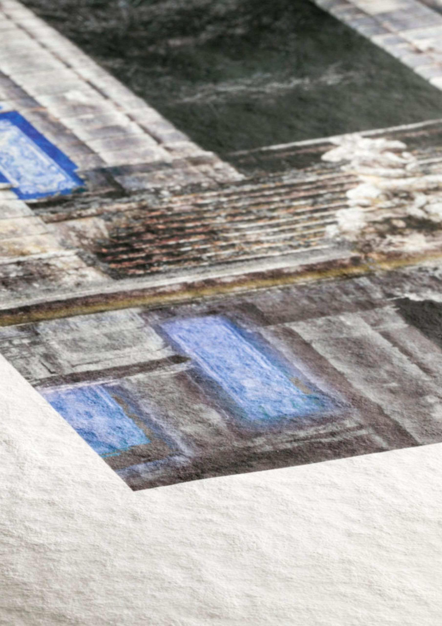
Hahnemühle is a 285 g/m² FineArt inkjet paper made from 100% α-cellulose and designed for giclée printing. It belongs to the Matt FineArt Textured range and is distinguished by a highly textured surface with a tactile quality that is evident from the very first touch. Its brilliant white color, combined with the premium inkjet coating with a matte finish, promotes rich reproduction of color, detail, and tonal depth. The texture of the paper itself does not act as a mere background, but as an active part of the visual interpretation of the image, providing relief, body, and a clear sense of three-dimensionality. It is an acid- and lignin-free paper that meets the most stringent requirements for aging resistance and is available in sheets and rolls for the production of exhibition pieces and conservation-grade art reproductions.
Technical Specifications
Weight: 285 g/m²
Composition: 100% α-cellulose
Finish: Matte
Base color: Bright white
Texture: Very pronounced felt-like texture
Type: FineArt inkjet paper
Acid- and lignin-free: Yes
ISO 9706: Yes
Recommended uses
Art / reproduction
It is ideal for reproductions of graphic art, illustrations, drawings, and works with an organic tonal structure. It also works particularly well for reproductions where the artist wishes to maintain a certain affinity with the character of art paper. Its smooth texture complements the image without competing with it, which is important when there are lines, brushstrokes, or glazes.
For watercolor reproductions or techniques that require very subtle brushwork, it provides a convincing background, although it lacks the pronounced texture of papers like William Turner or Torchon. Precisely for this reason, it can be a more balanced choice when you’re looking for character without excessive texture.
Black-and-white photography
It is one of their most interesting papers. Hahnemühle specifically Hahnemühle its excellent performance in monochrome prints, and it makes sense: the natural base and matte finish lend themselves to a subdued look, with a less glossy and more contemplative black and white.
I recommend it when an image needs depth, visual stillness, and a smooth tonal range. In portraiture, atmospheric landscapes, or conceptual photography, it can lend a very elegant presence. It wouldn’t be the best choice when a project relies on very deep blacks, maximum microtonal separation, or a more striking photographic aesthetic.
Color photography
It works particularly well with color when warm tones, organic hues, skin tones, earth tones, misty tones, vegetation, or muted palettes dominate. The image takes on a less digital and more tangible quality.
However, for photographs with very cool colors, extreme saturation, or a very sharp focus, this may not be the most suitable medium. In such cases, a whiter or smoother paper is usually more appropriate.
Exhibition projects / publications
Given its composition, stability, and compliance with ISO 9706, this paper is fully suitable for exhibitions, collections, and permanent publications. Hahnemühle its Digital FineArt collection for long-term use and claims it will remain stable for over 100 years under appropriate conditions.
On display, it has a very pleasing physical presence. It doesn’t draw attention through gloss or superficial spectacle, but rather through its texture, its tone, and its relationship with the image. This makes it particularly well-suited for artist-driven works, small-scale series, and projects where the medium itself is part of the artistic discourse.
Frequently Asked Questions About Torchon Paper (FAQ)
Is Torchon more of a photographic paper or an art paper?
It is clearly more of an artistic paper than a photographic one. While it can be used for photography, its defining characteristics lie in its texture and the way that texture influences the final interpretation of the image. When neutrality, a subtle surface, or maximum photographic precision is desired, there are usually better options within the Hahnemühle range.
Does texture enhance the image, or can it detract from it?
Both are possible. It greatly enhances images through gesture, atmosphere, visual elements, or pictorial intent. On the other hand, it can be distracting when the work relies on very fine details, very clean transitions, or geometric structures that require a more subdued surface. In Torchon’s work, texture always speaks; the question is whether that voice complements the piece.
Is it suitable for watercolor, engraving, or illustration?
Yes, and that’s where it tends to deliver particularly impressive results. Its textured surface and matte finish help convey the aesthetic of graphic art, illustration, and many reproductions of dry or wet techniques very effectively. It doesn’t reproduce the original exactly, but it does offer a highly credible interpretation with great visual impact.
Is it suitable for limited editions and archival use?
Yes. It is acid- and lignin-free and meets strict requirements for lightfastness, making it suitable for conservation, exhibition, and publishing projects. Furthermore, when used with lightfast pigment inks, Hahnemühle excellent long-term print stability.
Does it print well on desktop printers?
It is advisable to exercise caution. Hahnemühle specifically Hahnemühle that Torchon, despite its 285 g/m² weight, may not perform well in many desktop printers due to its stiffness and lack of flexibility when navigating tight turns. For this paper, it is important to carefully check the paper path or to use equipment designed for stiffer FineArt papers.
Do you need a specific ICC profile?
Yes, especially if you want color consistency and reproducibility in production. Hahnemühle using a specific ICC profile for each paper, since the base tone and surface structure influence the final result. With a paper as distinctive as Torchon, this is even more important.
Print your artwork on Hahnemühle paper with personalized professional guidance from Color3arte.

