Select page
Color3arte Logo

Sugar Cane by Hahnemühle
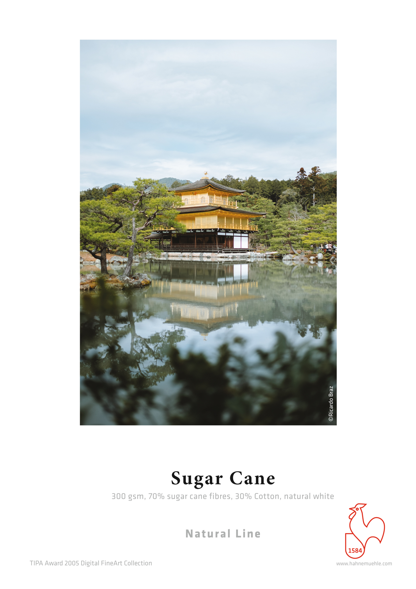
Hahnemühle Cane is a FineArt inkjet paper that is part of the Natural Line range, developed using sustainable and rapidly renewable raw materials. Its composition combines 70% sugarcane bagasse fibers—a natural byproduct of agricultural processing—with 30% cotton, resulting in a paper with great character and structural balance.

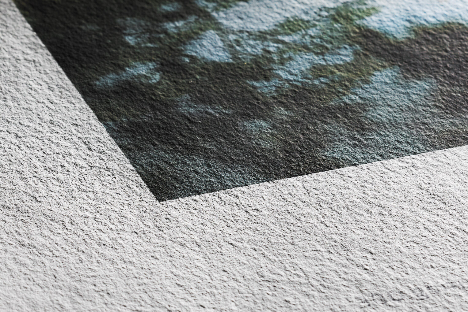
It features a natural white tone, free of optical brighteners, which provides a warm, long-lasting color base. Its clearly defined surface, with a perceptible texture, introduces a tactile dimension that actively interacts with the image.

It is coated with a premium matte inkjet coating that ensures accurate color reproduction, high detail, and a rich tonal range, particularly in warm tones and monochrome prints. This acid- and lignin-free paper complies with ISO 9706, guaranteeing museum-quality results and high resistance to aging.

Technical Specifications

  • Weight: 300 g/m²
  • Composition: 70% sugarcane bagasse · 30% cotton
  • Finish: Matte
  • Base color: Natural white (no optical brighteners)
  • Texture: Fine but clearly defined
  • Manufacturing: Art paper made with natural fibers (Natural Line)
  • Finish: Premium matte inkjet
  • Acid- and lignin-free: Yes
  • ISO 9706: Yes (museum quality)

What does it add to the image?

Sugar Cane offers a more organic and nuanced visual experience. Its surface is not jarring, but it is distinct enough to influence the overall perception of the image.

The blacks do not aim for maximum absolute density, but rather a softer, more open depth, which promotes a gradual tonal transition. Midtones develop naturally, without abrupt jumps, and highlights retain detail without appearing flat.

The color performance clearly leans toward warm tones. Colors are reproduced faithfully, but with a slight adjustment that reduces extreme saturation in favor of a more balanced image.

Texture acts as an interpretive filter: it doesn't interfere too much, but it does transform sharpness into a more painterly interpretation.

The Printer's Eye

It’s a paper that’s more surprising when you hold it in your hands than when you read about it. When you touch it, its distinct yet subtle texture gives you a clear hint of the direction the image will take: it doesn’t seek to dominate, but neither does it fade into the background.

In print, the first thing you notice is that everything moves at a slower pace. Blacks don’t appear all at once; they build up gradually. And in black and white, that’s a huge advantage when working with images that have a wide tonal range or delicate transition areas.

In terms of color, it has a very distinct character. It doesn't try to compete with brighter or whiter papers. Here, everything is more subdued, more natural. Skin tones, for example, look great because they don't appear artificial. But if you use a highly saturated or very cool image, the paper doesn't accentuate it; rather, it softens it.

It’s one of those papers I recommend when the image is meant to be more artistic than descriptive. When you want the paper itself to play a role. And also when you’re looking to move away from that more classic photographic finish.

I wouldn't use it if you need maximum sharpness or high contrast. But when a project calls for a more organic, more tactile look… then it works really well.

Sensory analysis

Texture and feel

A surface with character—distinctly noticeable yet not harsh. It has a natural, slightly fibrous texture that is very consistent with its plant-based origin.

Black-and-white behavior

Smooth transitions, well-defined blacks, and good gray-scale separation. It enhances images with tonal depth rather than harsh contrast.

Color behavior

Excellent for warm tones and natural color palettes. It adjusts the saturation and produces a more balanced result.

Physical presence at the exhibition

It has an elegant, distinctive presence. It doesn't stand out or compete, but it invites you to take a closer look. It works especially well in settings where the medium is valued as an integral part of the artwork.

Recommended uses

Art / reproduction

It works particularly well for reproducing graphic art, illustrations, and paintings where the original texture plays a significant role. It lends a sense of material authenticity and avoids overly digital-looking results.

Black-and-white photography

It is ideal for work that calls for a wide, gradual tonal range. It is not a paper with extreme contrast, but rather one that offers gentle depth and continuity.

Color photography

It works best with images dominated by warm tones, earth tones, skin tones, or scenes with natural light. It is not the best choice for extremely saturated or cool colors.

Exhibition projects / publications

Its distinctive character makes it an appealing choice for limited editions with a conceptual or artistic focus. It has a strong presence, but it isn't overpowering.

Color3arte ICC Profiles

Frequently Asked Questions

Is this paper suitable for commercial photography?

It is not the most common choice for standard commercial projects. Its interpretive nature may deviate from the more neutral reproduction typically required for such projects.

Does texture affect fine detail?

Yes, but in a controlled way. It doesn't eliminate the detail, but rather integrates it into a smoother, less analytical reading.

How does it compare to traditional cotton paper?

It is less neutral than pure cotton. It has more character and feels more organic, both visually and to the touch.

Is it suitable for large-format printing?

Yes, especially in works where texture and the support are part of the visual narrative. In large format, their impact is amplified.

What kind of images perform the worst?

Images with high saturation, very cool colors, or projects that require maximum technical precision and high contrast.

Sign up for our newsletter.

Join our mailing list to receive the latest news, offers, and updates from our team.

All set! We'll be in touch.