12 Hours with Chagall
12 Hours with Chagall.
Did Alois Senefelder ever consider what he was offering the world when he created, in the late 18th century, an inexpensive way to print sheet music and plays? Probably not, although years later he realized that his invention of lithography ended up being far more lucrative and interesting than the purpose for which it was originally conceived—a purpose for which it had little use.
One morning in July 1796, the German playwright wrote with a greasy pencil on a polished stone the list of clothes the laundress would take; as he did so, he recalled that for several months he had been trying to devise a method that would allow for the reproduction of a play he had written, which no publishing house would take on. That almost imperceptible domestic moment led him to experiment with reproduction methods based on the premise of the incompatibility between fat and water, and the technique of etching. Thus lithography was born, and soon artists discovered the advantages of the new process, which allowed them to draw directly onto the stone without the need for intermediate engravers.
In the 19th century, artists such as Goya, Daumier, Delacroix, Edvard Munch, Matisse, Braque, Picasso, Toulouse-Lautrec, Alphonse Mucha, and Andy Warhol elevated lithography to the highest level of artistic expression and quality.
However, it was not until the mid-20th century that the art world began to seriously engage with the art of printing art. Paris and Berlin began to introduce a concept as new as it was modernizing, initially known as the “new print”; or, in other words, the art of printing new forms, in what the world now knows as engravings, and they forever changed the face of print art.
Those were times when drawing reigned supreme; consequently, the field was dominated by line engravings—whether created using a burin, etching, or woodcut—a technique widely employed by the German Expressionists of the Die Brücke group, who were experts in depicting the human figure.
It was the logical response of what were then known as the “early avant-garde” movements, which made it clear that artists were inclined to improve and continue evolving in their vision of images through a quest that included tools, equipment, and technological mastery to provide the best foundation and support for the projects with which they hoped to fulfill their aspirations. The result was an improvement in technique and, with it, the discovery of new materials to perfect a product that, for the benefit of humanity, constitutes an invaluable legacy treasured in the world’s great museums thanks to the fact that it has been able to be printed and preserved through the use of various techniques. These are not original works, of course; yet some are of almost incalculable value.
Such is the case with the Vollard Suite, a collection of 100 engravings by Picasso considered among the most important works of modern art; approximately 300 sets were produced, and perhaps fewer than 20 survive in their entirety. Worldwide, only 10 museums possess the entire collection; the last to acquire it, the British Museum, paid nearly one million pounds sterling for the set of works in 2011.
The artistic process of creating and developing designs—using a medium and subsequently transferring them to a substrate—has undergone various changes that have made it increasingly precise and demanding, diversifying it to meet specific needs.
It is possibly the oldest printing technique, although it is not necessarily used to reproduce an existing work. Screen printing is usually used to create a specific final image that is reproduced almost identically multiple times. It has been known since 960 AD and is believed to have been invented by the Chinese Song Dynasty. The technique is still in use today and serves as a medium of expression in the graphic arts.
It is considered a distinct artistic printing technique and is used to reproduce a drawing in print form, using a stone or a metal plate to transfer the artist’s work directly onto paper. Oil-based inks are applied to plates that are pressed onto paper; each plate yields a limited number of copies. If the print quality is outstanding and only a small number of editions have been produced, it holds significant value.
Stone used for lithographic printing featuring a Princeton University motif. Collection: Princeton University Library. Princeton University; Princeton, NJ. Image in the public domain.
It is the process of creating a photographic image that is printed with ink on paper rather than on a photosensitive material. Essentially, and although the term is very broad, any work of art reproduced by photomechanical means is a reproduction. It can be considered a first step in the transition from analog to the digital age. In the field of photomechanical reproduction, several processes are known, namely prepress, or photomechanics, which led to the use of large printing presses and special cameras that separated colors; offset printing, which utilized a three-cylinder system to improve print quality; and a variety of other techniques such as flexography, gravure, and wood engraving.
Photomechanical printing Public domain image .
This is the highest-quality print, created from a digital file using sophisticated inkjet printers that produce prints with immense depth of contrast, vibrant colors, and excellent resolution.
A print created using the Giclée technique Giclée remain unchanged for over 100 years, making it the preferred method of illustrators, fine art photographers, and, in general, art connoisseurs who, as we have seen in our studio at COLOR3ARTE, enjoy not only the magnificent results but also our passion for the art of printing art.
The Art of Forging Art / Authenticate Your Artwork:Han van Meegeren’s painting“The Last Supper I” at the 11th Art and Antiques Fair in Rotterdam on August 31, 1984. – In the summer of 1938, Han van Meegeren moved to Nice. In 1939, he painted “The Last Supper I” in the style of Vermeer. Image: GaHetNa Nationaal Archief NL/Wikimedia.
Self-Portrait by Han van Meegeren (Public Domain)
Han van Meegeren, a Dutch painter who died in the mid-20th century, shares a strange and inglorious rivalry with Elmyr de Hory: they are arguably, to this day, the two most famous art forgers in history. Their truly fascinating lives and exploits fill the pages of 20th-century art history and are deeply rooted in their lack of success as original painters: they were extraordinary artists who, having failed to succeed in their own creative endeavors, devoted their time to developing an incredibly difficult skill: painting in the style of another.
In May 1945, Allied forces interrogated the banker and art dealer Alois Miedl about the newly discovered Vermeer. Based on Miedl’s confession, the painting was traced back to Han van Meegeren.GaHetNa (Nationaal Archief NL)Photographer Koos Raucamp
They were so skilled at it that they managed to make millions by deceiving museums, collectors, and above all, wealthy snobs who were too snobbish to dare subject their artworks to more thorough examinations that might have revealed the truth. In 1940, Han van Meegeren painted the work “The Supper at Emmaus.” It is an oil-on-canvas painting in the style of Vermeer, believed to be the most famous and well-executed forgery in history. This painting is, by the way, very interesting; Meegeren passed it off as an authentic Vermeer (a renowned Dutch painter and creator of the famous painting “Girl with a Pearl Earring”) and sold it as such, slipping it into museum collections for several years. But in reality, Vermeer never painted religious scenes (33 works by the Dutch painter are known), and “The Supper at Emmaus” is an oil painting by Caravaggio, the famous 17th-century Italian painter whose work bears no relation to the forgery.
Dinner Dinner at Emmaus by Han van Meegeren 1936–1937, not by Vermeer. Image: Wikimedia Commons
The Art of Forging Art / Have Your Print Certified
The story of Elmyr de Hory is very similar. His paintings—known in art circles as “pastiches” because they are works that attempt, with varying degrees of success, to imitate someone else’s style—are so widely held in private collections and even in museums around the world that, upon his death in 1976, it was determined that at least 1,000 forgeries, distributed worldwide by unscrupulous dealers, had found their way into the most famous art collections on earth.
Emir del Hory paintings: Public Domain
Neither of them ever considered themselves forgers, much less were they aware that their true art was that of swindling. Hory, for example, was an expert in fake Picassos that were inexplicably well-placed; for a scholar of the Malaga-born painter’s work to take even a cursory look would have revealed the inaccuracies in the brushstrokes and other details typical of a Hory pastiche, thereby dashing his ambitions.
The Art of Forging Art / Have Your Print Certified
Artist: Han van Meegeren 1935–1943 Images courtesy Color3arte theRijksmuseum, provided to Color3arte
Both, however, were tried as forgers, and during one of his trials, Meegeren painted—right in front of the authorities—a Vermeer so authentic that it left everyone with the impression that the man was a photocopier; he avoided a life sentence after being identified as a collaborator.
They went down in history; although their endings were far from happy, they managed to avoid prison sentences and gained recognition. The 21st century has seen numerous exhibitions of their legacy—both their forgeries and their scarce original work—at prestigious venues such as the Círculo de Bellas Artes in Madrid.
The Trial of Han van Meegeren: Images and Video ( Creative Commons)
The Art of Forging Art / Have Your Print Certified
It is certainly an anecdote, but it perfectly illustrates the importance of certifying a work of art in the art world. This is a process that should not be entrusted to individuals without sufficient training, and it is becoming increasingly demanding, as certification legally guarantees that a work belongs to a specific artist based on the analysis of certain rigorous criteria. Authentication adds value to the work in the art market, facilitating its sale between private individuals.
However, not all certificates hold the same value in a commercial transaction involving the artwork in question. There are some extraordinarily curious cases; for example, it has been proven that, in the official catalog of Georges Braque’s work, there are two pieces that are not his, but were authenticated by him during his lifetime. Therefore, although these works enjoy double certification—since they appear in the official catalog of his work and bear the painter’s authentic signature—they do not even remotely reach the price of a Braque work if they go up for auction.
Tribute to Braque. The painting is on view atthe Es Baluard Museum of Modern and Contemporary Art in Palma
Something similar happened with the Zurbarán catalog, which initially consisted of more than a thousand works. Following a thorough study conducted in 2010 by the French historian Odile Delenda, nearly 700 works were removed from the catalog, not because of their dubious origins but because it was certain they were not the work of the famous painter of the Spanish Golden Age. That study served to establish Zurbarán’s oeuvre as a collection of approximately 300 works.
To determine the final price of a work of art, factors such as the work’s age, its presence in museums, level of authenticity, style, and artist are taken into account, as well as technical quality consistent with that attributed to the artist in question; immense value is placed on the credibility and academic and professional prestige of the curator responsible for issuing such certification. In fact, there is a very short list of professionals worldwide who are qualified to do so.
To determine whether that specific work belongs to the artist who signed it, and to confirm whether the work is an original, a forgery, or even the work of another painter, photographer, or illustrator who belongs to the same artistic movement and uses a similar signature.
It's a task we take very seriously at COLOR3ARTE. Not only do we preserve the authenticity of what we reproduce and defend the right of the photographer and/or illustrator to ensure their work is not used for purposes other than those they intend, but we are also aware that the print quality we offer can tempt certain art dealers to act greedily; for this reason, all works that arrive at our workshops do so with the artist’s approval or with the clearest possible indication of origin.
After all, although the law establishes that it is the express intent to deceive on the part of the person creating the fraudulent work that defines a reproduction of a work of art as a forgery, we take great care to respect the work of the photographer or illustrator who visits us. In fact, we are fortunate to be able to certify the work that comes out of Color3arte, as the author is usually involved in the process.
The Art of Forging Art / Have Your Print Certified

All rights reserved
What is Fine Art Giclée Printing, and What Is Its History?
Images of Henry by Wilhelm fromWilhelm Imaging Research, Inc. Courtesy of Nash Editions for Color3arte
The world of fine art printing has undergone a dramatic transformation since 1991, when the term “Giclée” first appeared to describe what is also known as fine art prints.It is a truly innovative concept in which technology, human talent, and top-quality resources come together in perfect harmony to produce works of art.
Giclée, a French term pronounced “yiclé,” is an image printing technique whose name derives from the verb “gicler,” meaning “to spray.” It involves spraying pigment in the form of microscopic droplets onto the canvas or paper in a continuousstream , much like a high-pressure spray nozzle.
Unlike most continuous-ink printers, which release controlled amounts of ink only when necessary,in the Giclée printing process,ink is applied to the substrate with millimeter precision and under high pressure,thanks to a vibration system using piezoelectric glass components. In this process,the ink droplets are given a specific electrical charge so thatthose that are not neededare electrostatically deflected into a waste collection system that does not interfere with the printing process.
This system, which—like all technology—requires a level of precision that seems almost miraculous, produces prints of a sharpness that would be unimaginable under any other working method. That is why it is so highly valued as a printing method. Thanks to the use of special inks and papersspecific to this technique, fine art prints are guaranteed to last almost forever.
One of the wonders of giclée printing is its ability to capture the precise details of forms. Even if other methods were used for this purpose, without fine art printing techniques, certain edges, textures, and patterns that define the image would not be reproduced on paper with such precision, andthe continuous tone—especially in grays or blended shades—would not be as accurate.
Furthermore, “fine art” is a term directly associated with papers of the highest quality. It is not just an empty label; the paper used in fine art printing must meet very specific quality criteria. We’re talking about papers whose composition differs significantly from standard photo paper; they’re made of natural fibers, mostly cotton or alpha-cellulose, haven’t been artificially bleached with chlorine,have a neutral pH, and undergo a special treatment that ensures the print’s longevity.
What is Fine Art Giclée Printing, and What Is Its History?
Un pionero en el uso de impresoras de inyección de tinta en color de alta resolución en el campo de las bellas artes es Nash Editions. Ubicado cerca de Los Ángeles en Manattan Beach, California, Nash Editions fue fundada por el británico Graham Nash del legendario grupo de rock de los años 60 Crosby, Stills, Nash & Young. Nash, un gran fotógrafo y coleccionista, se sintió atraído por el proceso de inyección de tinta como un medio para imprimir fotografías que había escaneado y trabajado con el software Adobe Photoshop en su computadora Apple Macintosh. Aquí se muestran los miembros del personal de Nash Editions (de izquierda a derecha) Jack Duganne, R. Mac Holbert y Graham Nash. Esta fotografía y las fotografías de la página siguiente fueron tomadas por el autor durante una visita a Nash Editions en febrero de 1992, poco más de seis meses después de su apertura comercial. <www.nasheditions.com>
Jack Duganne, an expert in the field of printing and head of the Fine Arts department at Nash Editors, coined the term “Giclée” to describe this unique method of printing images. IIn 1991, he realized there was a need to clearly distinguish between the types of printing produced by the famous Iris printers, which had already coined the term “Iris Proof” for a type of high-quality printing—which was actually considered a proof—before the job was ordered in large quantities.
This well-known printing method had the drawback of appearing too industrial, not quite in keeping with the spirit of the craft—if you will, artisanal—yetof the high qualitydemanded by the artists,photographers , and graphic designers of the time.
To achieve this distinction and meet the technical demands of the market, Duganne drew on the verb “glycer” to find a word that would set his work apartfrom industrial block printing. This was due, above all, to a technological innovation that originated in Stoneham, Massachusetts, the headquarters of Iris Graphics.
Jack Duganne and Holbert are working on an image in Photoshop on an Apple Macintosh computer with New York City fashion photographer George Holz (center).
The first location of Nash Editions, which was originally housed in this picturesque building, not far from Los Angeles International Airport.
Images of Henry by Wilhelm fromWilhelm Imaging Research, Inc. Courtesy of Nash Editions for Color3arte
What is Fine Art Giclée printing? And what is its history?
Two employees of Applicon, the leading company in the field, founded Iris Graphics, Inc., and developed its Iris printers, which quickly became the preferred method for reproducing graphic works on various media: paper, canvas, silk, linen, and certain textiles. It was very well received by printing specialists, photographers, artists, and even color engineers, as they were indeed dealing with a printer capable of producing high-quality images with exceptional color definition—so much so that it was selected by David Coons, the color engineer at the Walt Disney Company,to print the new 3D images from Disney Studios.
It was Coons who wrote the printing manual for such major projects as Sally Larsen’s “Transformer” series, published in 1989, and for a 1990 exhibition by Graham Nash of the supergroup Crosby, Stills, and Nash. Nash is a photography collector and a published photographer who was so impressed with the quality of the reproductions of his works presented in the exhibition that he invested $126,000 in an Iris printer and founded Nash Editions, where Duganne coined the term “Giclée” for the work they were doing.
Iris inkjet printers apply the cyan, magenta, yellow, and black images in a single pass, with the printing material attached to a rapidly rotating drum. With the cover removed, the main band of the image printed by the cyan inkjet, which moves slowly across the image from left to right, is clearly visible. Photo 2: Bottlesof the water-based inks used in Iris inkjet printers. Initially designed for graphic arts proofing, standard Iris inks have very poor lightfastness. Inks made with dyes that have improved lightfastness for fine art and photography applications became available in 1994.
Most likely, without the initiative of those two Applicon employees, Graham Nash’s vision, and Jack Duganne’s expertise, the world of fine art printing would not be the same—and perhaps the possibility of producing images whose sharpness and color are exactly as the artist envisions them in his mind before daring to put them on paper would not exist.
Crosby, Stills & Nash (CSN) is a folk-rock supergroup consisting of American singer-songwriters David Crosby and Stephen Stills, and English singer-songwriter Graham Nash. When Canadian singer-songwriter Neil Young joins them as the fourth member, the group is known as Crosby, Stills, Nash & Young. Courtesy of Wikipedia
Our commitment to honoring this creative process is closely linked to the deep respect we have for our clients—mostly graphic designers from diverse backgrounds, with varying styles and approaches—who want to see their work brought to life on paper exactly as they envisioned it when they first created it. Images are the narrative tool most likely to remain in human memory forever. That is why at COLOR3ARTE we are committed to preserving history, because we are aware that when there is nothing else to rely on to weather the times, there will be images that narrate the only thing that stirs human memory; that is why we do not compromise on the high quality of our work. Simply put, we prioritize it above all else.
What is Fine Art Giclée printing? And what is its history?
After finishing college, Mateo went on the trip of a lifetime. He had become a nature photographer after a long journey that began when, at his First Communion, a friend of his parents gave him a simple camera with which he took endless photos of everything that caught his eye. Now, having finally earned his business degree, two well-deserved rewards awaited him: a magnificent Canon EOS 4000D, a gift from his parents, and a few days in Sri Lanka—his dream.
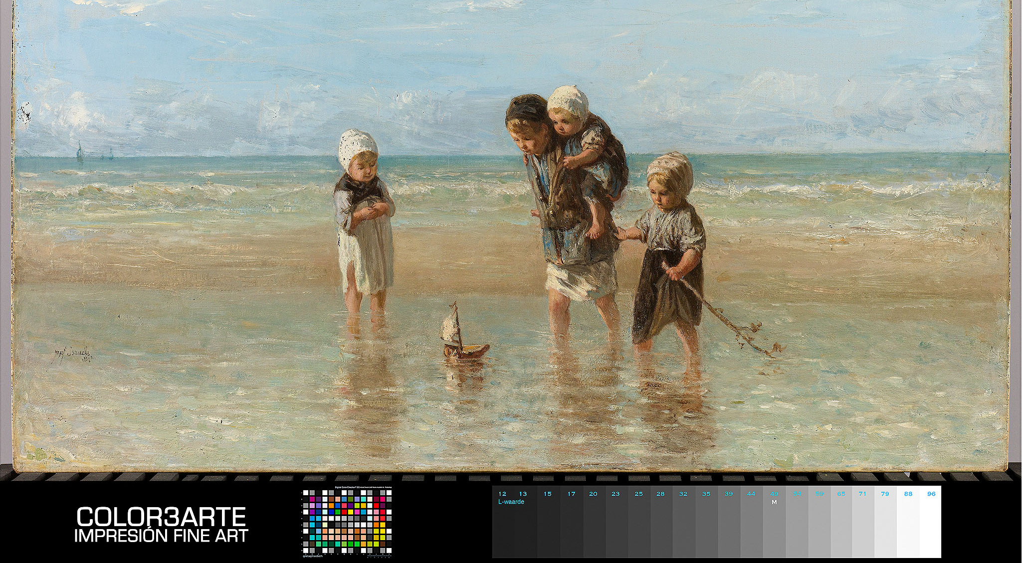
He had spent the past year devoting himself with equal passion to preparing for the trip and completing his degree. He was driven by a single goal: to capture the best photographs of Sri Lanka’s stilt fishermen—those lanky men perched on rudimentary wooden stilts, 4 meters high, in the Indian Ocean, harpooning fish to earn their livelihood.
The trip—as fascinating as any visit to the island regions of Asia can be—brought him to the brink of believing that happiness was synonymous with each passing day, as he photographed everything that defined the region known as “the teardrop of India” until, upon arriving in Unawatuna, he felt his heart race at the thought of life’s great opportunities.
He left that place—the world’s largest gathering of stilt fishermen—with more than 900 photographs of twilight scenes, wooden stilts, bare torsos lashed by the tide, feet cracked by salt, and fish—perhaps millions of them—harpooned from the impossible vantage points of those artisans whom he considered heroes.
Back home, the hard work of selecting and editing the hours he had spent on the Asian coast began. It was such a daunting task that he considered it impossible. The fact that he managed to do it had a lot to do with learning that a renowned publication dedicated to nature and travel was holding its annual photography contest—one of the most famous in the world.
He managed it without quite knowing how: ten images that captured, with crystal-clear clarity, a day in the life of one of these men weathered by the sea. They were perfect photographs. They were, as his mentor told him, “the kind of photographs that magazine editors go crazy for.”
Without further delay, Mateo reviewed the contest rules and prepared his entry. Unusually, the contest rules required a specific digital file and also stipulated that entrants “be prepared to submit, if requested, a set of hard copies of the works entered in the contest.” Mateo was so confident that his work would rank highly in the selection process that he decided to take the initiative and request that the series submitted digitally be printed.
He went to a fine art printing studio; there, they took his order and put him in touch with the printmaker, who wanted to speak with him. He thought something was wrong with the file and anxiously waited for the bad news.
The printmaker then went on at length. Mateo, despite having spent years reading and studying the art of photography, admitted that he was unaware of fundamental aspects of a photographer’s work. He felt more like an amateur than ever.
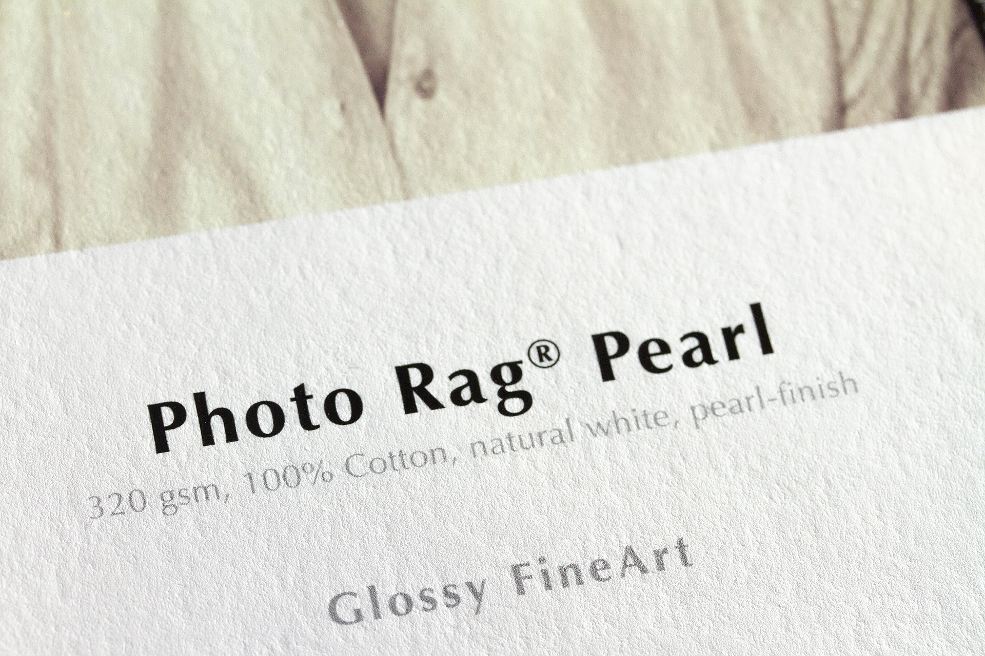
(Mateo felt overwhelmed when he realized they were comparing his photos to *Las Meninas*, so he listened closely.) The expert, accustomed to technical jargon, carefully explained to him that they were talking about a unique medium, made of natural cotton fibers, unbleached with chlorine, that lasts forever.
They were discussing what is known as ink and pigment absorption: the surface layer of fine art paper is so flawless—thanks to its neutral pH—that the ink adheres completely, even enhancing the visual texture of the photograph. A print that lasts forever—as they say in the world of fine art printing, without any exaggeration.
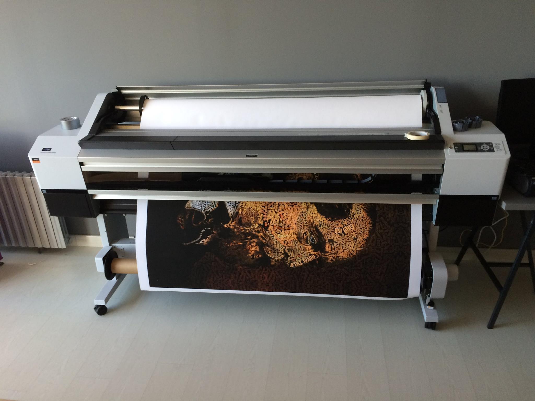
As they talked, they weighed their options. Each sheet of paper was more delicate and finer than the last, making it almost impossible to choose just one. After much consideration, they settled on Hahnemühle Rag® Baryta 315 g/m² · 100% cotton · white · high gloss, and the printing process began.
Mateo decided to pick up the photos the following afternoon. When he saw them, he knew that something had changed in the way he appreciated photographic quality. Those printed photos were unrecognizably better than his own. Certainly, he thought, the paper he’d chosen had brought out the countless textures and delicate edges from the screen—the very details he’d taken such care to preserve when capturing the image. He was stunned.
The email asking him to send the printed photos as soon as possible, given his status as a semifinalist in the contest, arrived a few weeks later. Mateo read it several times, unable to take his eyes off the photos spread out in his room, protected as if they were gold bars. He felt his pulse quicken and remembered, with gratitude, the infinite kindness of that Sri Lankan fisherman who had allowed him to witness the intimate details of his trade. He set about carefully packing the shipment.
A few days later, an unknown voice called to inform him of the award decision: his photos had won a substantial prize, would be featured in an exhibition at a New York museum, and would be permanently displayed on the website of the prestigious publication.
He had become a renowned photographer.
So, Mateo’s gratitude will forever include the kind man who had convinced him that the medium on which a work of art is created is an important part of the work itself; after all, he was the one who first convinced him that he was capable of creating works of art; at that moment, he smiled at his sister’s camera.
La gama Natural Line ocupa un lugar muy especial dentro de la Digital FineArt Collection de Hahnemühle. Con los papeles Bamboo, Hemp y Agave, Natural Line ofrece una colección de papeles FineArt Inkjet a base de unas materias primas fuera de lo tradicional.
Las plantas de las que se obtiene la celulosa para estos papeles crecen con rapidez y no requieren el uso de pesticidas para su cultivación. Gracias a su crecimiento acelerado, son capaces de proporcionar más celulosa en la misma superficie de plantación
que otros cultivos, aparte de requerir menos agua que aquellos. Esto nos permite ser más respetuosos con los recursos naturales y contribuir a la protección del medio ambiente.
Los nuevos papeles FineArt Inkjet de la gama Natural Line son un paso más en nuestro compromiso de aumentar nuestra sostenibilidad y de ser más cuidadosos con nuestros recursos.
La gama Natural Line completa la línea Digital FineArt Collection con unos papeles a base de unas materias primas fuera de lo normal. En el marco de la iniciativa Green Rooster, esta gama fomenta varios proyectos para la protección del medioambiente a nivel regional e internacional.
En Hahnemühle, TRADICIÓN y RESPONSABILIDAD son palabras que se escriben en mayúscula. Y es que, quien produce papel desde hace más de 435 años en la misma fábrica, ya ha comprendido la importancia del equilibrio entre la industria artesanal y el medio ambiente. Hahnemühle se encuentra en la linde de una reserva natural, una realidad que nos obliga a actuar con gran precaución y con un profundo sentido de la responsabilidad. A su vez, cumplimos con los estrictos estándares medioambientales alemanes.
Ser la fábrica alemana más antigua de papel artístico hace que estemos orgullosos de nuestros productos, que son un paradigma de calidad, consistencia, inspiración y sostenibilidad. Todo el papel producido por Hahnemühle combina la experiencia de nuestros fabricantes de papel en una fábrica que cuenta con la innovación de nuestros ingenieros del papel; para el desarrollo de nuevas fibras o tecnologías de bajo consumo energético que contribuyan a una producción respetuosa con el medio ambiente. Desde el año de la fundación, en 1584, producimos papel de primerísima calidad con agua pura de manantial y fibras naturales. Sin estas materias primas, la producción de nuestros papeles de alta calidad sería impensable. Por este motivo, nos sentimos especialmente comprometidos con el medio ambiente, por lo que asumimos la responsabilidad de la repercusión que nuestra empresa pueda tener en la sociedad y el medio ambiente. Desde 2008, nuestra iniciativa Green Rooster brinda su apoyo a proyectos de protección medioambiental internacionales y regionales. Entre ellos, se incluyen programas de reforestación, protección de animales y sensibilización sobre medio ambiente. Estos proyectos son muy importantes para nosotros y nos complace aportar una parte de nuestros beneficios de Natural Line a la protección del medio ambiente y del clima. Hoy por hoy, ya se han destinado más de 220 000 € para financiar distintas iniciativas medioambientales, a lo que hay que sumar el 5 % de las ganancias obtenidos de nuestro papel “verde”.
Recent comments